Why are coronavirus rates rising in some areas of England and not others?
Growing alarm has been expressed over the rising number of people who are testing positive for COVID-19 in the UK. More tests have been made available and more people have been taking those tests, but that alone does not explain the increases in the numbers of those who have tested positive, nor why there is such variation across different parts of the nation.
We can explore a number of theories as the basis for this increase. For example, children returned to schools in Scotland on August 11, and eight days later cases in Scotland peaked at 141 before dipping and then rising further again. A similar pattern was seen in England. It’s also likely that people returning from holidays with the infection contributed to these rises.
The role of schools
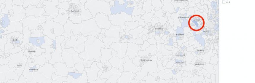
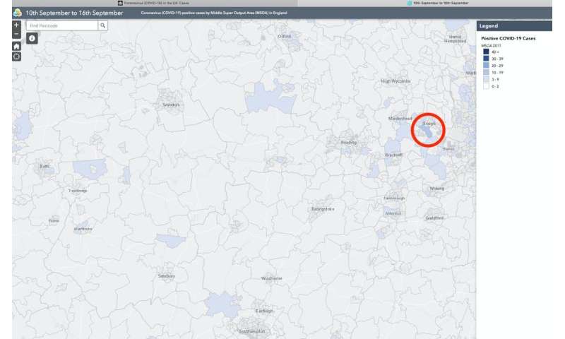
Using the government-provided data dashboard allows us to zoom in on a map of positive COVID-19 tests around the UK. One of the authors of this piece, Danny Dorling, lives in Oxford. When the case numbers first rose abruptly, he identified where the largest increase occurred near to his home. This was a neighborhood that is mostly made up of a school, Eton College, located in the town of Windsor some distance away to the south-east. In the week ending September 16, this neighborhood had one of the largest rises in cases reported in the south of England, but there were also similar rises in the north.
The dashboard shows that there were ten or more cases in the school’s area in the week of 10-16 September. The students had just returned from holidays, after which “a few” of them returned positive results when the school decided to test them all, according to a statement from Eton. This is a good example of how the number of positive cases increases when more testing is done, but it also shows how schools reopening can increase cases.
Incidentally, 63 years ago—and in a very similar way to today—the Manchester Guardian reported that half the boys at Eton had been struck down in the influenza pandemic of that year, which was also badly affecting schools in Glasgow.
The map below shows just how unusual the Eton cluster was when it emerged. It was one of the first educational outbreaks in England this autumn. Oxford can be seen in the north of the map and the school can be found just south of Slough. At this point, it was the only neighborhood with 10-19 cases in that very large area. Each neighborhood in the map below is called an MSOA (middle layer super output area) and there are 6,791 of them in England.
Former hotspots are less affected
Apart from particular schools resuming teaching, what else might explain why rates of new cases have been rising in some areas more than others?
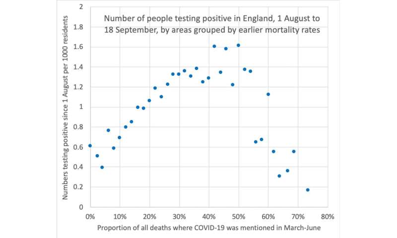
The best predictor for England seems to be how severely each neighborhood was affected when the disease first arrived, which is illustrated by the graph below. If we look at the proportion of all deaths in which COVID-19 was mentioned on the death certificate reported in an area in the months of March, April, May and June, we can see that where that proportion was under 30% the first time around, the number of positive cases subsequently found in those neighborhoods tends to vary between 0.4 and 1.4 per 1,000 residents, rising linearly with the severity of the initial outbreak. This might be as expected if the disease had remained at a higher (although still low compared with the peak) level in some of these places, or if people in some regions were elderly or in care homes that made them more susceptible.
There are other possible interpretations of this finding. One is that the new cases simply reflect a proportional resurgence of those earlier outbreaks—that is, a continuation of the first wave re-emerging more severely where more cases occurred previously. Other possibilities relate to testing. For example, more test centers may have been placed in areas that suffered more deaths early on, so a larger fraction of all cases in those regions are being detected. Other changes to testing regimes could influence case numbers.
A potentially more significant possibility is suggested by this graph if we look to its right-hand side. This pattern implies that areas with the highest levels of previous mortality do not show marked resurgences of cases this time around. Specifically, in neighborhoods where between half and three-quarters of all the earlier deaths were thought to have involved or been directly caused by COVID-19, the numbers of people recently testing positive for the disease falls dramatically.
Possible explanations
It is still too early to know exactly what the patterns most recently revealed mean in epidemiological terms. Each week, we get more data that will help us explore this, chance fluctuations also matter, but there are some possible explanations to consider in the short term and others that we do not have space to elaborate on here.
It could be that enough people in these areas have already come into contact with the virus to render the population less susceptible to the disease. Overall, this would imply that the levels of some forms of immunity in those particular neighborhoods are higher—at a level that leads to a detectable reduction in the number of new cases.
Such immunity will not be all or nothing—it will not mean that people are no longer in any way susceptible to coronavirus infection—rather it would mean that people need a more sustained, higher viral-load exposure to become infected, or, if infected, show fewer symptoms and so are less likely to be tested. Testing regimens could also be influencing this pattern.
Source: Read Full Article